
Brands We Grew Up With Then & Now
Ten Brand Changes That Happened So Gradually Nobody Noticed
Packaging, logos and shop fronts rarely change overnight. Ten slow transformations that happened in front of everyone, over decades, without anyone reacting.

Brands change constantly, but almost never suddenly. A logo redesign that arrives overnight gets complaints; one that arrives over twenty years, in ten small steps, gets nothing at all.
This is a deliberate strategy with a name in the design industry — evolution rather than revolution — and it works because visual memory is far less precise than people think. Ask someone to draw a famous logo from memory and the results are usually wrong in ways that surprise them.
Here are ten changes that happened in plain view, counting up to the one that reshaped whole towns.
-
Number 10: Logos lost their outlines
Illustration: World of Curious Printing in the mid-twentieth century needed heavy black keylines to stop colours misregistering. As printing improved, the outlines were thinned and then dropped entirely. Most brand marks today have no outline at all, and almost nobody remembers when they did.
-
Number 9: Wordmarks lost their serifs, then got them back
Illustration: World of Curious The move from serif to plain sans-serif lettering was near-universal from the 1960s onwards, sold as modernity. In the last decade a lot of brands have gone back the other way, for exactly the same reason.
-
Number 8: Packaging got taller and narrower
Illustration: World of Curious Shelf space is charged by width, so packaging quietly grew upwards instead of sideways. The volume often stayed similar; the silhouette changed completely.
-
Number 7: The illustrated character was replaced by a photograph, then by nothing
Illustration: World of Curious Mid-century packaging used drawn characters because photography was expensive to print well. Better printing brought photographs. Minimal design then removed both.
-
Number 6: Colours got flatter
Illustration: World of Curious Gradients, drop shadows and bevels arrived with digital design in the 1990s, dominated the 2000s, and were stripped out again during the 2010s. The same logo often went round that loop twice.
-
Number 5: Shop signs stopped being three-dimensional
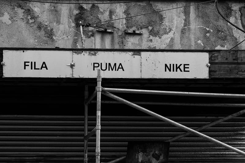
Oliver Gargan — CC BY-SA 4.0 — Wikimedia Commons Individually mounted letters with returns and internal lighting gave way to flat printed panels, then to flat panels with backlit letters. The change is obvious in old photographs and invisible in real time.
-
Number 4: The word Limited disappeared from the front
Illustration: World of Curious Company names on packaging used to carry their legal form, along with an address. Both moved to the back, then into smaller type, and the front became a single word.
-
Number 3: Instructions moved from the pack to a website
Illustration: World of Curious Products that once printed full instructions on the box now print a short line and a web address. The information did not get simpler; it moved.
-
Number 2: Tins stopped needing a tin opener
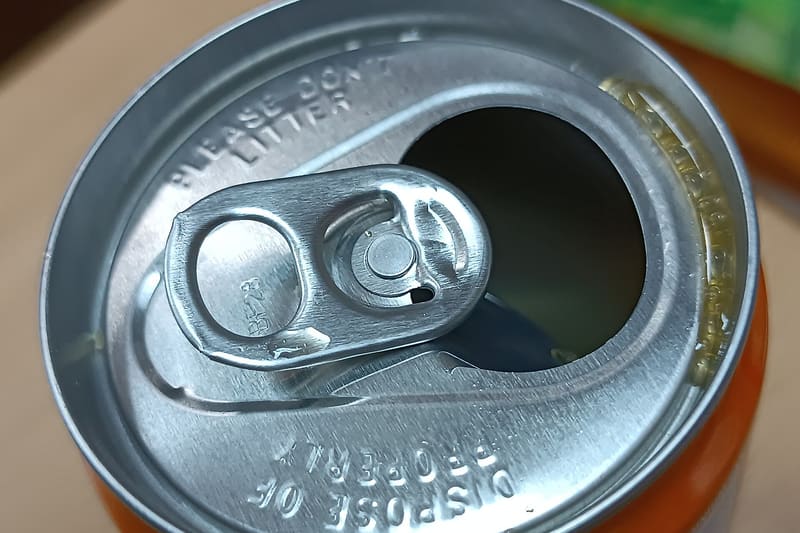
Shunfeng 2088 WEIA — CC0 — Wikimedia Commons Ring pulls spread gradually across categories over about thirty years, starting with drinks. A kitchen drawer in 1975 needed an opener every day; one today might go weeks.
-
And the strangest one of the lot
Number 1: The high street stopped being independent
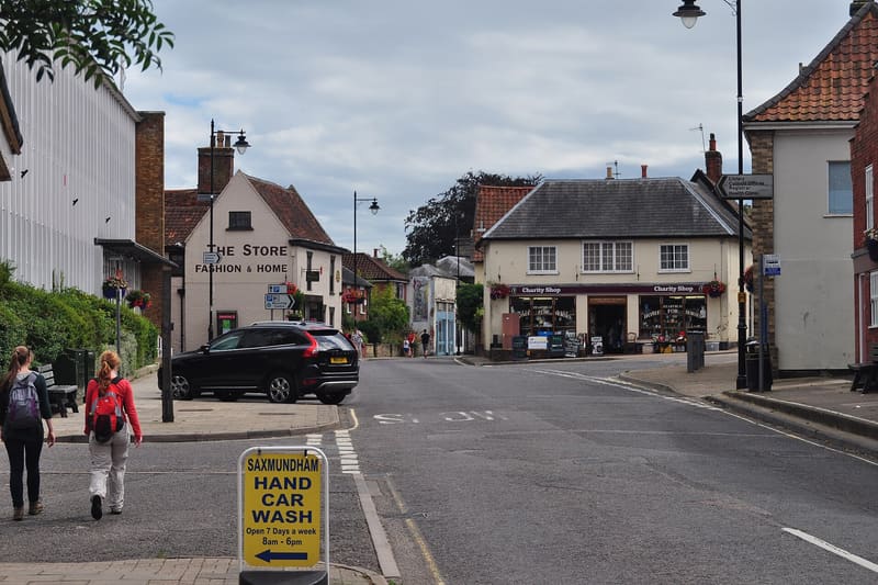
Arjen Bax — CC BY-SA 2.0 — Wikimedia Commons This is the change that happened most slowly and mattered most. A typical British or Australian high street in 1970 was dominated by independently owned shops: a butcher, a greengrocer, a hardware shop, a chemist, a newsagent. The same street today is dominated by chains, supermarkets and food outlets. No single closure was newsworthy, and each one was replaced within a few months, which is precisely why the overall change was so hard to see while it was happening.


Slow change is the hardest kind to notice, which is why it is worth occasionally looking at an old photograph of a street you know well.
Where this came from
- Design and packaging collections — Victoria and Albert Museum
- Advertising and brand history collections — The Museum of Brands
Read next
 Then & Now
 Ten Everyday Objects That Changed Shape for a Specific Reason
Plug pins, bottle bases, milk cartons and the humble pencil. Ten familiar objects whose current shape solves a problem you have probably never noticed.
Ten Everyday Objects, a Century Apart
The same object in 1925 and today, and the specific reason each one changed: new materials, new rules, cheaper manufacturing or a job that disappeared.
 Countdown
 Fifteen Objects That Were in Every House and Are Now in Almost None
Not antiques. Ordinary things, so common that nobody photographed them, which is exactly why they are so hard to picture now.